Introduction
Welcome to the Levven Brand Guide
This comprehensive resource is designed to encapsulate the essence of Levven, outlining our mission, vision, and core values. Here, you’ll find detailed brand guidelines that ensure consistency across all communications, including logo files, color palettes, typography, and more. Our goal is to empower you with the tools and knowledge needed to represent Levven authentically and compellingly, whether you’re part of our internal team or a valued partner. Dive in to understand what makes Levven unique and how we strive to make homes more affordable, personal, and sustainable.
How to navigate this book
The Levven brand guide is divided into an introduction, our core elements, and how everything comes together in the real world. In each section, you’ll find guidelines, rules, and all the downloads you’ll ever need. Please use them. For special requests, contact our marketing team at marketing@levven.com.
Vision and Mission
Our Vision
To accelerate, efficient sustainable construction
Our Mission
To provide technology and insights that make buildings more affordable, personal, and sustainable.
Our Values
Be Accountable • Take responsibility for your actions, decisions, and their outcomes. Own your tasks and deliver on your commitments, ensuring transparency and reliability in all that you do.
Act with Integrity • Maintain honesty and strong moral principles in all interactions. Uphold ethical standards and do the right thing, even when no one is watching.
Do What it Takes • Show dedication and perseverance in achieving your goals. Go above and beyond to meet challenges head-on, demonstrating resourcefulness and a strong work ethic.
Be of Service • Prioritize helping others and making a positive impact. Foster a supportive environment where the needs of customers, colleagues, and the community are met with empathy and dedication.
Tone of Voice
At Levven, our voice is bold, confident, and backed by data and customer insights. This guide is designed to help you communicate in a way that reflects our brand's core vision and value. By following these principles, you'll ensure that every interaction resonates with the strength and innovation that define Levven.
1. Innovate with Intent
• Share the Journey: Engage with customers, partners, and colleagues as fellow travellers.
• Empower Success: Highlight how Levven’s solutions foster collaboration and drive collective achievements.
• Build Relationships: Foster a sense of community and shared purpose in all communications.
2. Bold In Style
• Inform with Precision: Use data and insights to provide clear, accurate information.
• Show Expertise: Demonstrate Levven’s thought leadership and innovative solutions with confidence.
• Be Strategic: Craft messages that are not only informative but also strategically align with Levven’s goals.
3. Insightful in Form
• Engage Warmly: Write with a welcoming tone that invites interaction and fosters trust.
• Simplify Complexities: Break down technical jargon into accessible language that anyone can understand.
• Celebrate Customers: Focus on the human element by sharing stories and successes from our customer community.
Levven enables homeowners to control their energy use, saving both money and the environment.
With Levven, you can easily customize your home automation to fit your unique lifestyle and needs.
Levven’s Switched Right™ solution makes installation quick and cost-effective for builders.
Levven provides insights that help homeowners optimize their energy consumption and reduce your carbon footprint.
Levven offers excellent proactive support to keep your system running smoothly.
Levven products are good for saving energy.
Levven systems can be modified to work with various home setups.
Installing Levven tech is pretty fast and not too pricey.
Levven gives you some data on using less energy.
Levven has support if you need help with their products.
We Talk About
Empowering Customers: Highlighting how Levven enables users to control and optimize their home environments.
Sustainability: Discussing the environmental benefits of using Levven's energy-efficient solutions.
Innovation: Showcasing Levven’s cutting-edge technology and its impact on modern living.
Data-Driven Insights: Explaining how data from Levven’s systems can provide actionable insights for better home management.
Community Engagement: Sharing stories and testimonials from satisfied customers and partners.Customer Support: Emphasizing the high level of support and service provided to Levven users.
We Don't Talk About
Generic Product Features: Avoiding vague statements about the products without highlighting their unique benefits.
Negative Comparisons: Not speaking poorly about competitors or their products.
Technical Jargon: Steering clear of overly technical language that may confuse the audience.
Unverified Claims: Refraining from making unsupported claims about the product’s capabilities.
Price Points: Not focusing solely on cost without explaining the value provided.Irrelevant Topics: Keeping the conversation focused on Levven’s core mission and offerings, avoiding unrelated topics.
Color
Our color palette is integral to shaping our brand identity. Each carefully curated hue has been thoughtfully selected to reflect and amplify our vision, values and unique character.
Primary Colors
Levven’s primary colors, Sapphire and Prussian Blue, were chosen to convey trust and reliability. Sapphire adds a vibrant, grounded energy, while Prussian Blue provides a stable, professional tone. Together, they capture Levven’s core values and strengthen brand recognition.
Prussian Blue

HEX: #004FE9
CMYK: 90 70 0 0
RGB: 0 79 233
Sapphire Blue

HEX: #00256B
CMYK: 100 95 30 20
RGB: 0 37 107
Secondary Colors
Our secondary colors, Spring and Seafair Green, introduce a lively sense of innovation and enjoyment, perfectly embodying the spirit of Levven. Spring Green adds a refreshing brightness, while Seafair Green lends a subtle, playful touch, creating a balanced palette that feels both approachable and forward-thinking. Together, these colors reinforce Levven’s commitment to quality, innovation, and a user-friendly experience.
Spring Green

HEX: #21CA6C
CMYK:75 0 90 0
RGB: 33 202 108
Seafair Green

HEX: # BDF9D5
CMYK: 45 0 40 0
RGB: 189 249 213
Greys
These neutral tones are perfect for when you need something discreet and easy on the eye. They make great companions to our main colors and work well as a background.
Light Gray 1

HEX: #F7F7F7
CMYK: 2 1 1 0
RGB: 247 247 247
Light Gray 2

HEX: #EFEFEE
CMYK: 5 3 4 0
RGB: 239 239 238
Light Gray 3

HEX: #E7E7E6
CMYK: 8 6 7 0
RGB: 231 231 230
Light Gray 4

HEX: #DFDFDD
CMYK: 10 8 10 0
RGB: 223 223 221
Logo
Like our brand, our illustrations have a lot of character. Use them to add flair and dress up your content.
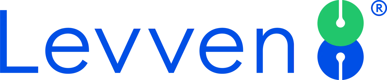
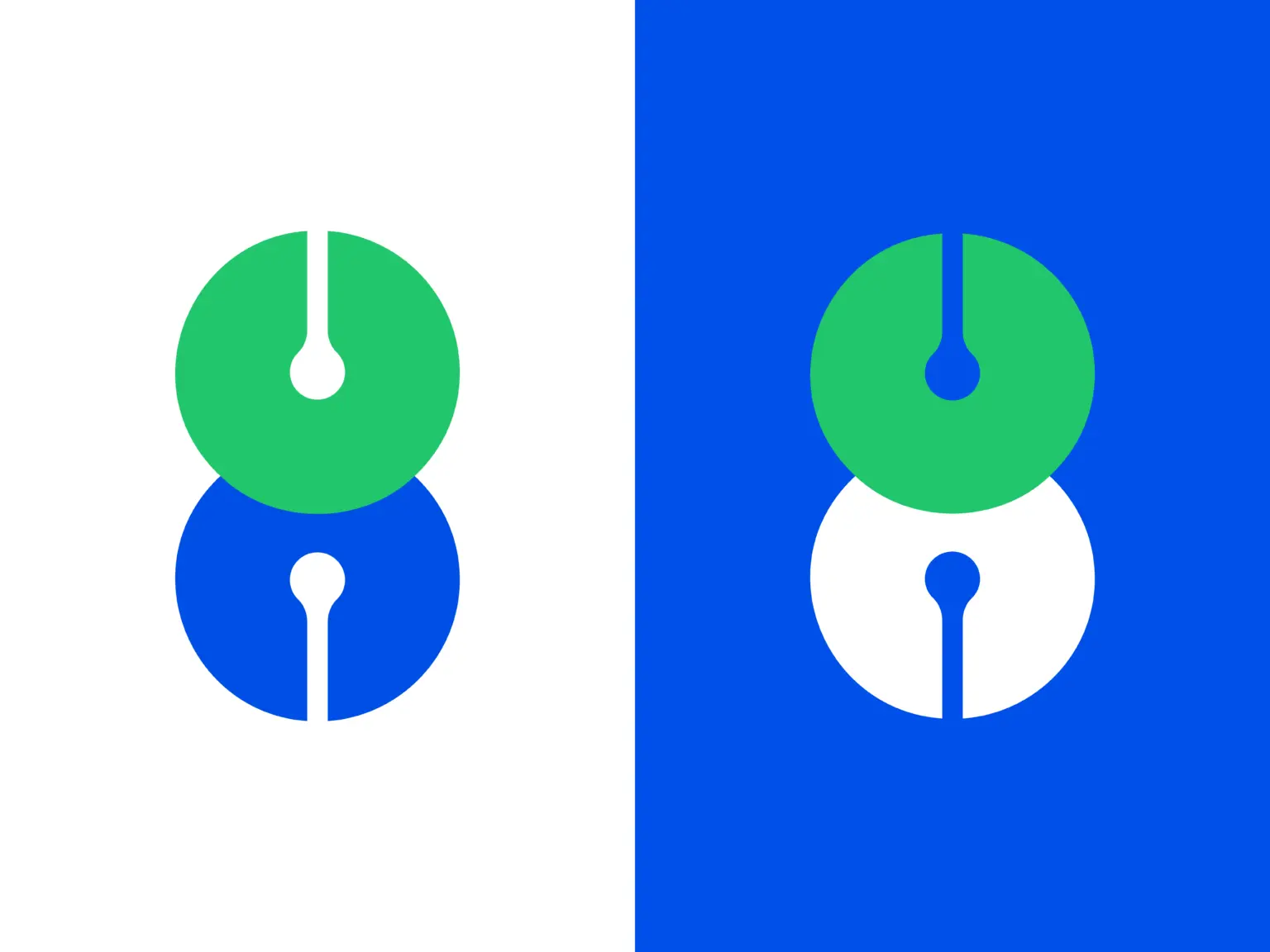
Logo
Full Logo

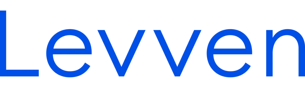
Symbol
Wordmark
Spacing and Adjustments
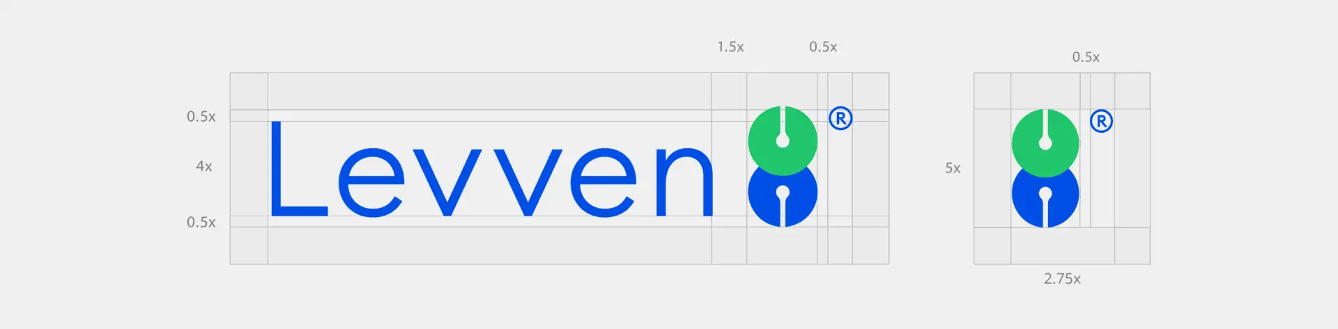
Minimum Size
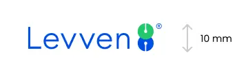
Keep a minimum height of 10mm
Digital
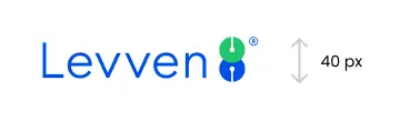
Keep a minimum height of 40px
Logo Variants


Sign Board

Emblem
Typography
Meet our typeface, Poppins - a versatile typeface that empowers the brand to communicate with authority and grace.
Our Typeface
Our official typeface is Poppins. It is a family of contemporary fonts. In terms of design, Poppins is a sans; however, its letters feature of kind of stroke-contrast that set them apart from other sans serifs.
ABCDEFGHIJKLMNOPQRSTUVWXYZ
abcdefghijklmnopqrstuvwxyz
1234567890+!@#$%>&*()
XXXL - Poppins - 80px - 120%
Drive change into your organization
XXL - Poppins - 60px - 120%
Drive change into your organization
XL - Poppins - 40px - 130%
Drive change into your organization
L - Poppins - 32px - 130%
Drive change into your organization
M - Poppins - 24px - 130%
Drive change into your organization
S - Poppins - 20px - 130%
Drive change into your organization
XS - Poppins - 16px - 140%
Drive change into your organization
XXS - Poppins - 14px - 150%
Drive change into your organization
Body Text
Body L - Poppins - 24px - 150%
Choose from 200+ templates designed to engage your team and drive action. Brand them with a single click.
Body M - Poppins - 20px - 150%
Choose from 200+ templates designed to engage your team and drive action. Brand them with a single click.
Body S - Poppins - 16px - 150%
Choose from 200+ templates designed to engage your team and drive action. Brand them with a single click.
Kerning
Openly adjust letter spacing if it improves readability. For example, in headlines, some pairs of letters create awkward spaces, so the space between them needs adjusting. Expanding or condensing the space between characters is known as kerning.
Ligatures
Ligatures are designed to allow certain combinations of characters to sit closer together. However they can be visually distracting, especially in headlines. To turn ligatures off, Deselect the ‘fi’ button on the ‘Opentype’ panel.
Illustration
Like our brand, our illustrations have a lot of character. We have two types that we use for our deliverables.
3D Illustrations
These are 3D unique illustrations that can be used to explain a concept or showcase a feature. They can be used in the app, blog articles, and/or social media — always with a limited amount of colors and details.
Scene Illustrations
Scenes are more elaborate, detailed illustrations. They are great resources for article covers, and can also appear in other materials such as ads and presentations. This type of illustration usually contains more than one layer of information (background, main element, other details etc.) and can contain more colors.
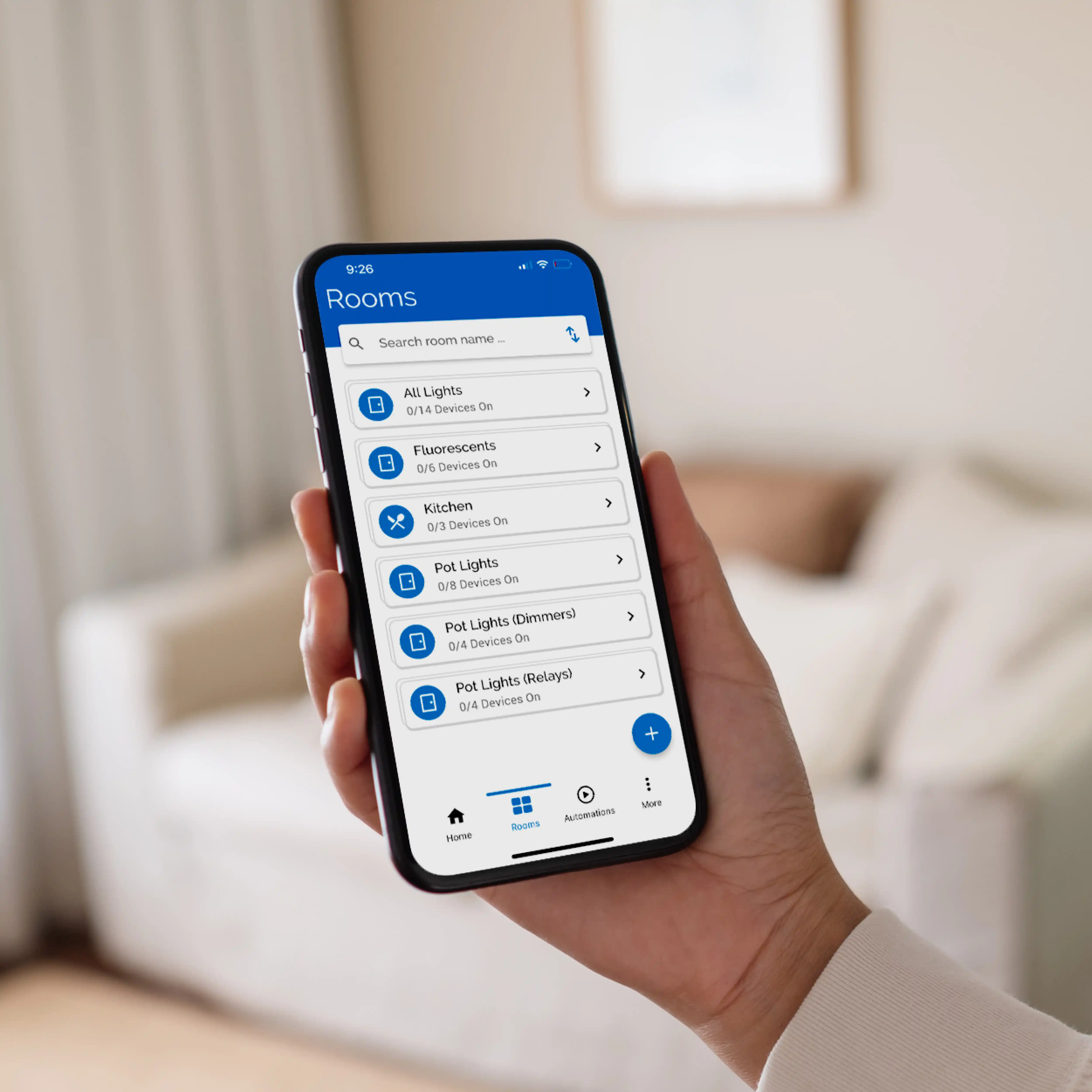
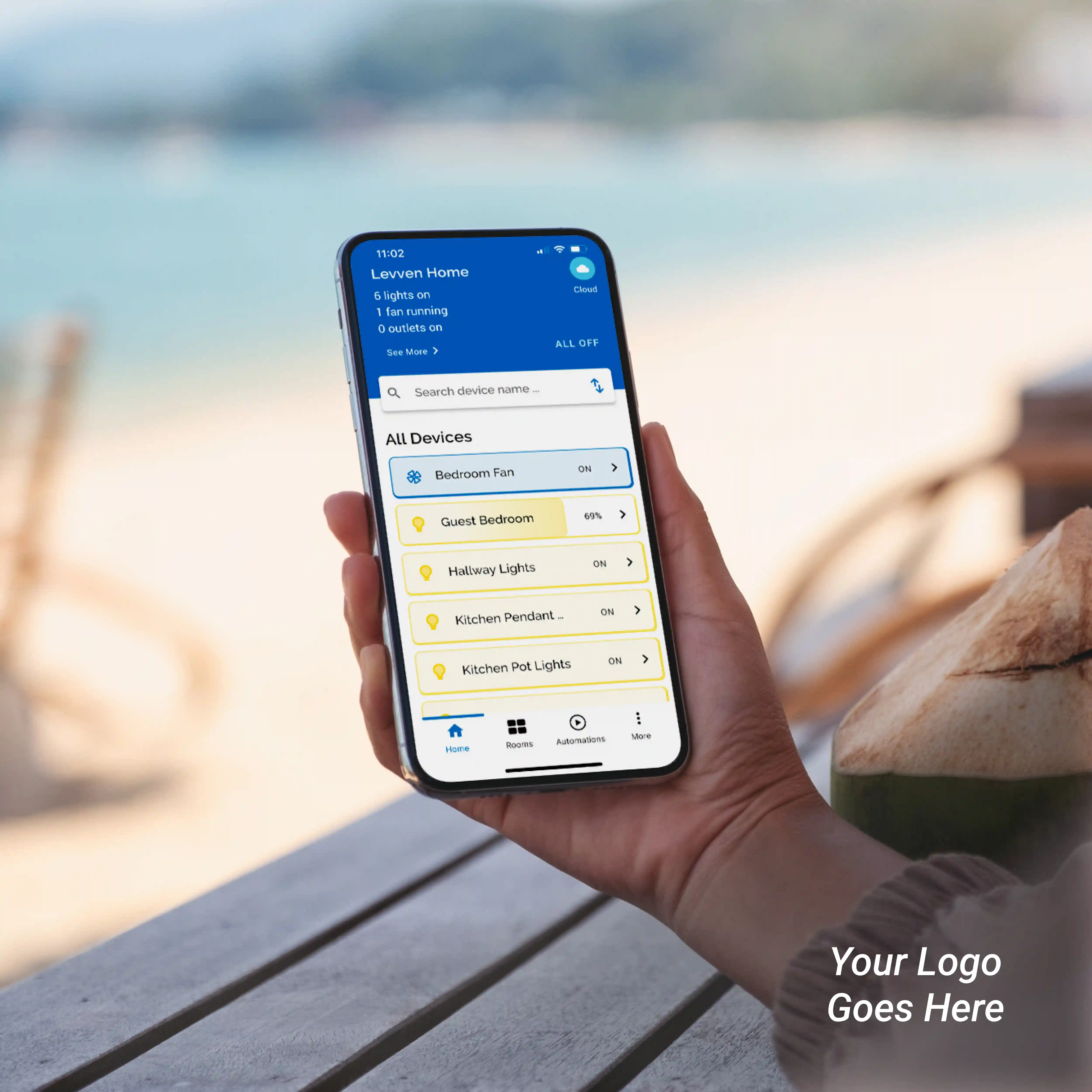
Interface Illustrations
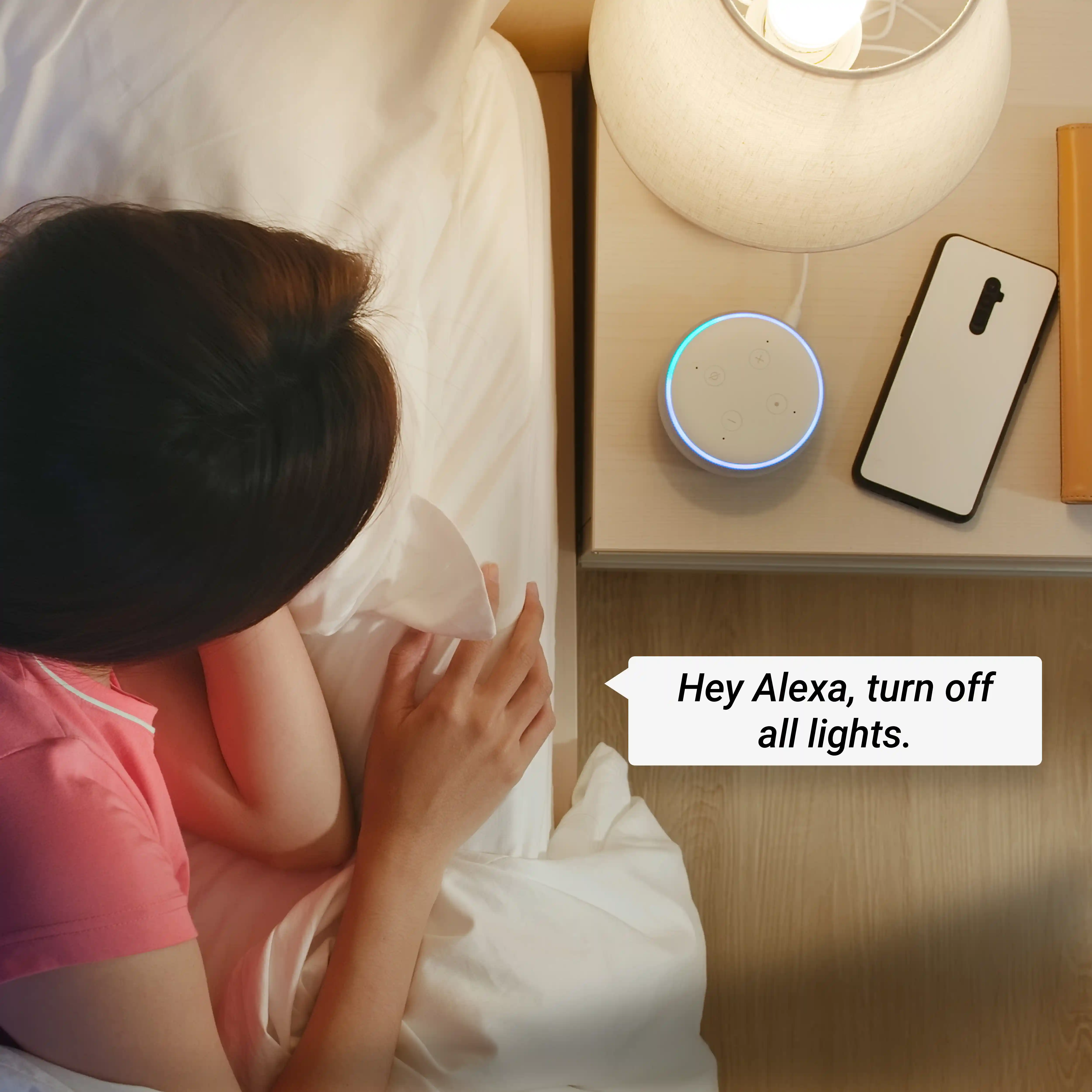
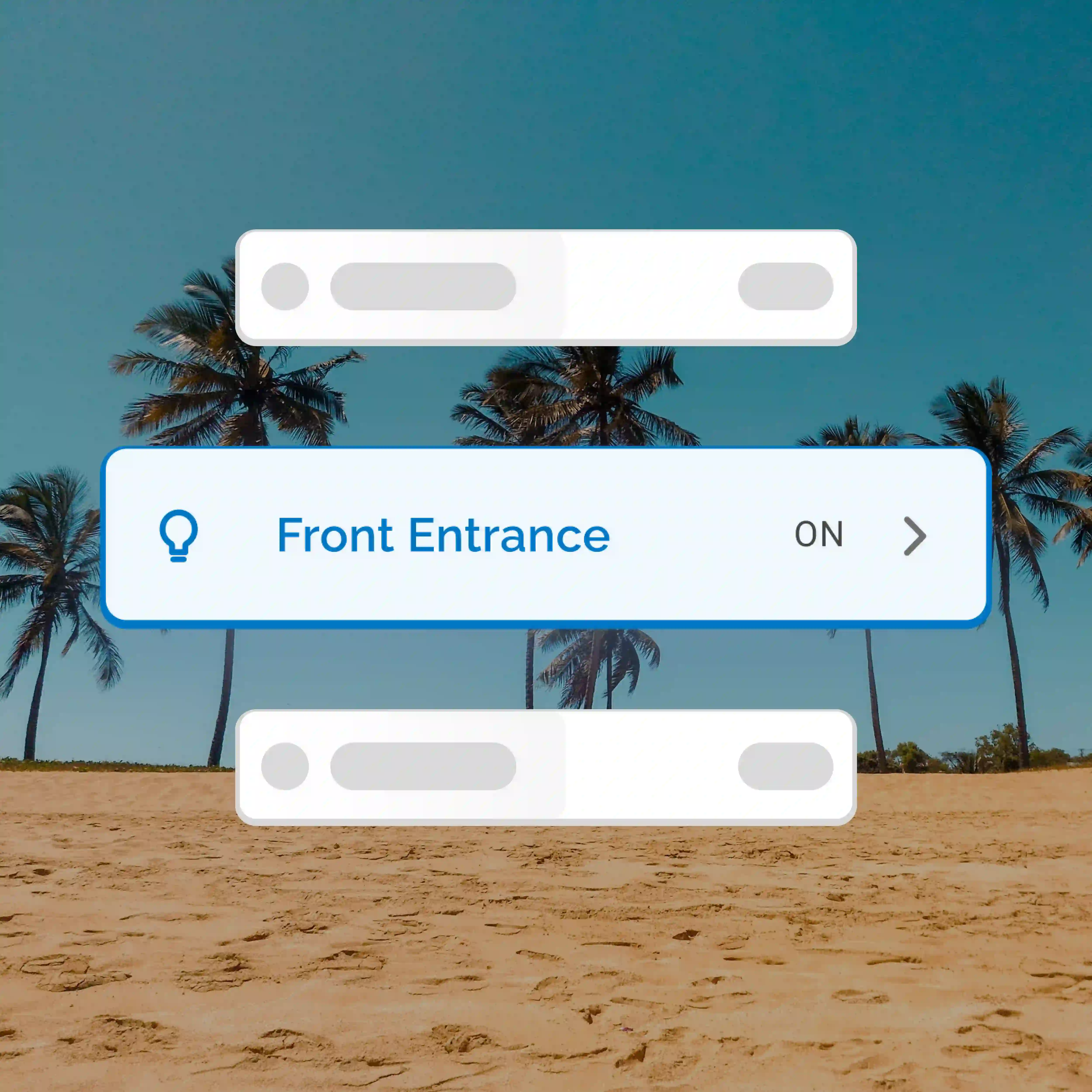
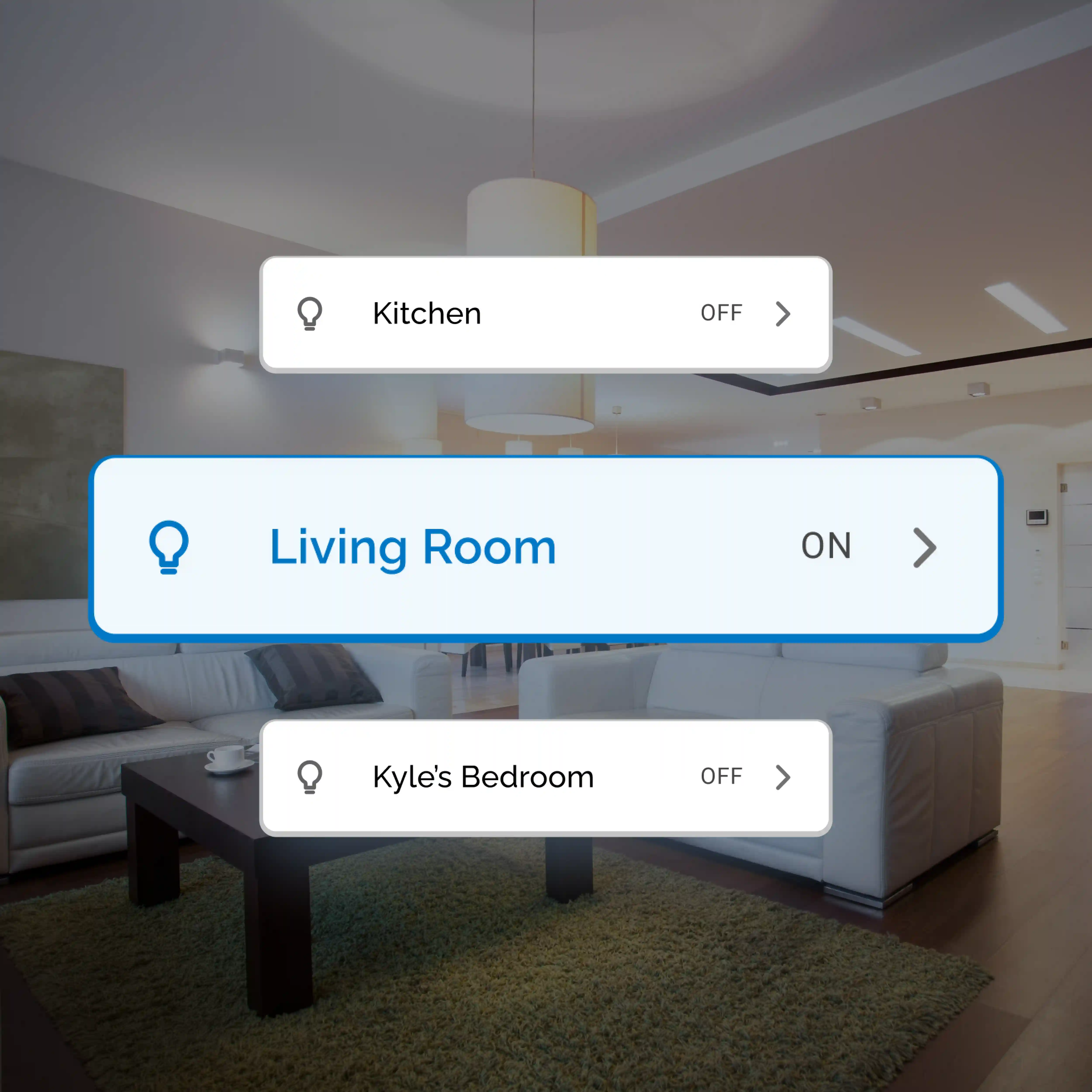
Often we need to represent our platform and features in a simplified way — this is where interface illustrations come in. They showcase our product with a more minimal approach that can easily be understood by the user, without losing the core concept. They can contain text and real interface elements, but with a limited amount of detail to keep the focus on what is important.
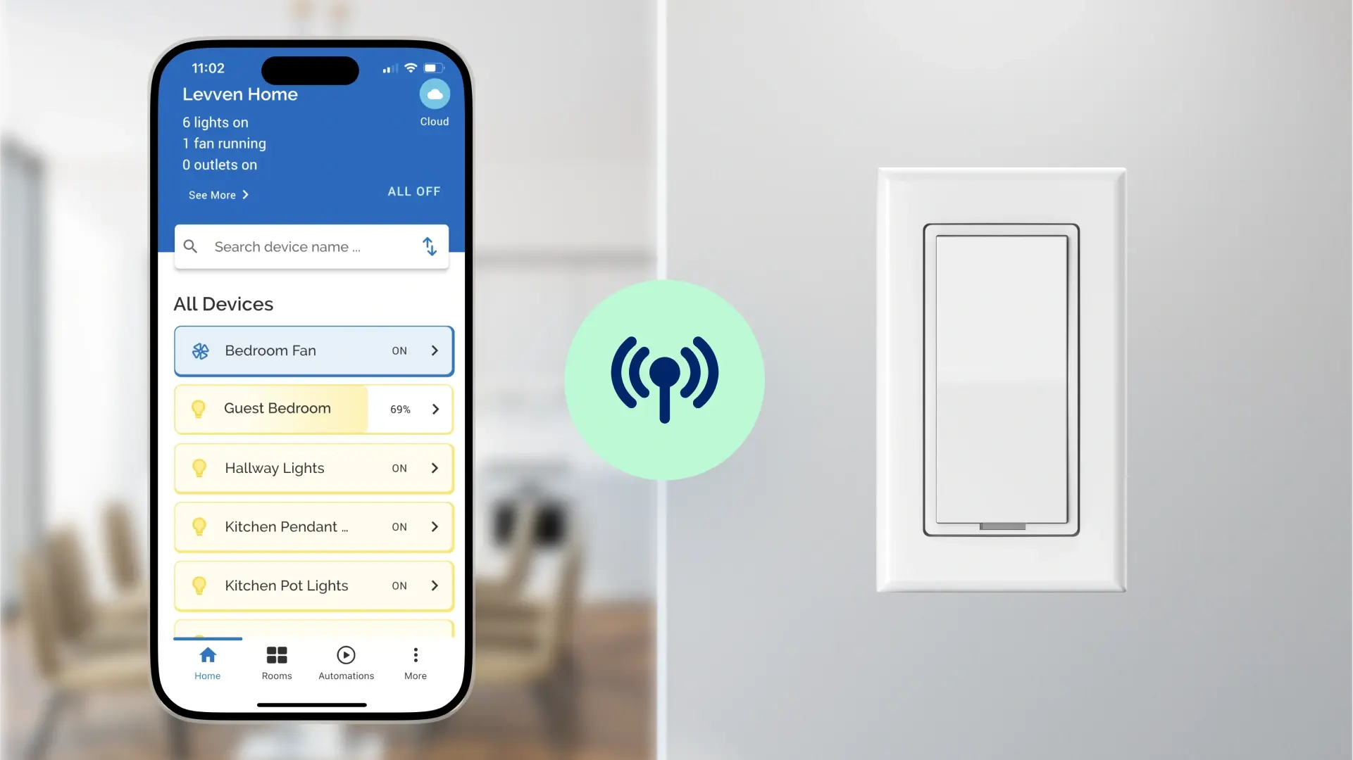
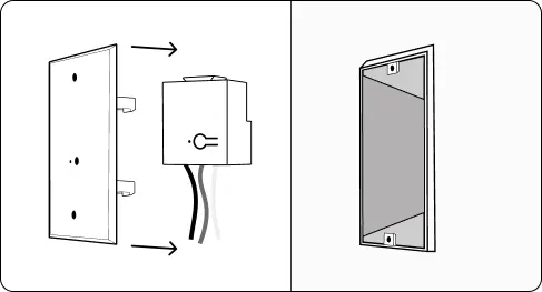
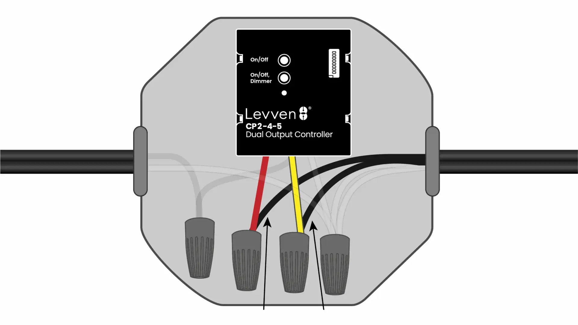
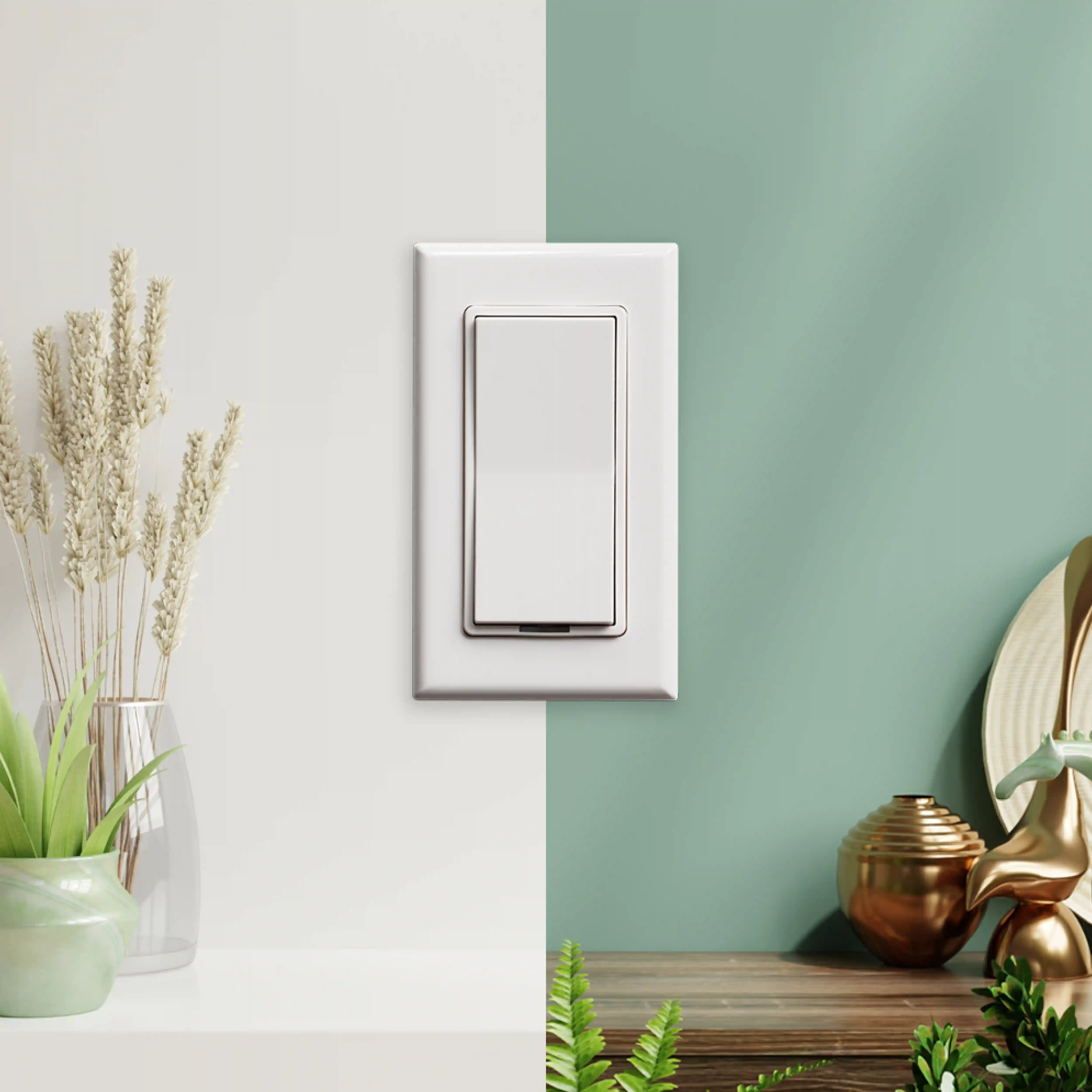
Product/Documentation Illustrations
Fills and Lines
Our line diagrams are primarily composed of clean, simple outlines, using minimalistic designs to convey information clearly. Lines are used to highlight details or serve as subtle background elements, adding a touch of sophistication to the overall composition.
Colors
lllustrations are primarily shown in grayscale (black and white). Color is only used when necessary to enhance product demonstration and functionality, such as in controller wiring diagrams.
Iconography
Our design features offer a range of tools to create visually stunning websites. Utilize WYSIWYG editors, drag-and-drop building blocks, and Bootstrap-based templates for effortless customization. With professional themes and an intuitive system, you can design with ease and precision, ensuring a polished, responsive result.
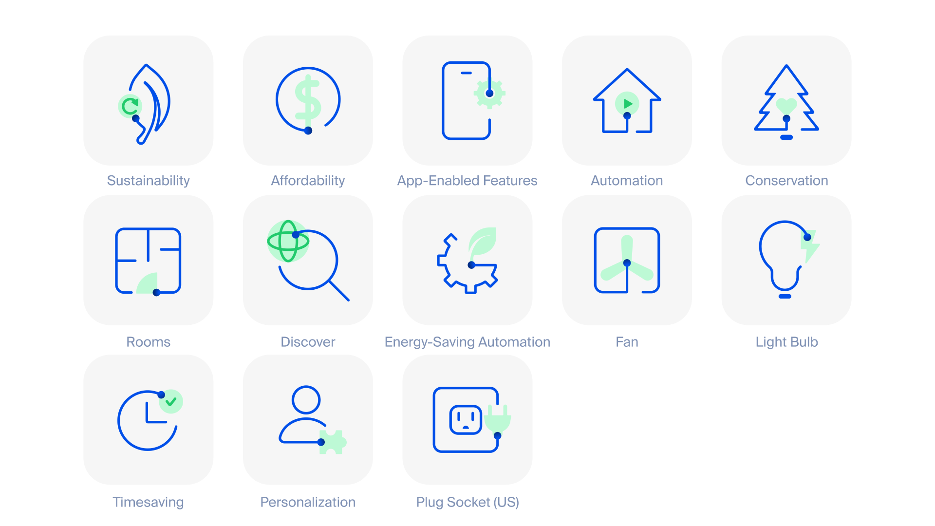
Flat Icons
Our flat icons can be seen almost in all our media. From our website to our brochure, they can be used anywhere. Rely on them when words are not enough.
Follow the grid
Our icons are carefully designed following a grid. All icons are drawn on a 24x24px grid frame, with a 2px stroke width for outlines. Each frame includes keylines and a 1px padding on all sides as guidance. It’s acceptable to go beyond the padding or off the keylines if this will improve the balance of an icon. If you need of a new icon, follow the guidelines on our Figma doc, or make a request to the design team.
Isometric Icons
Enhance your design with added detail. Our isometric icons bring depth and clarity, making it easier to communicate concepts and ideas. Its main use is for infographics, presentations, and landing pages.
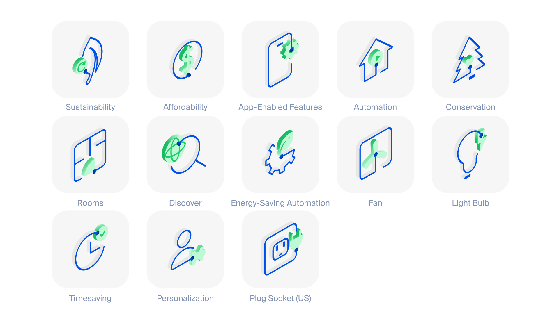
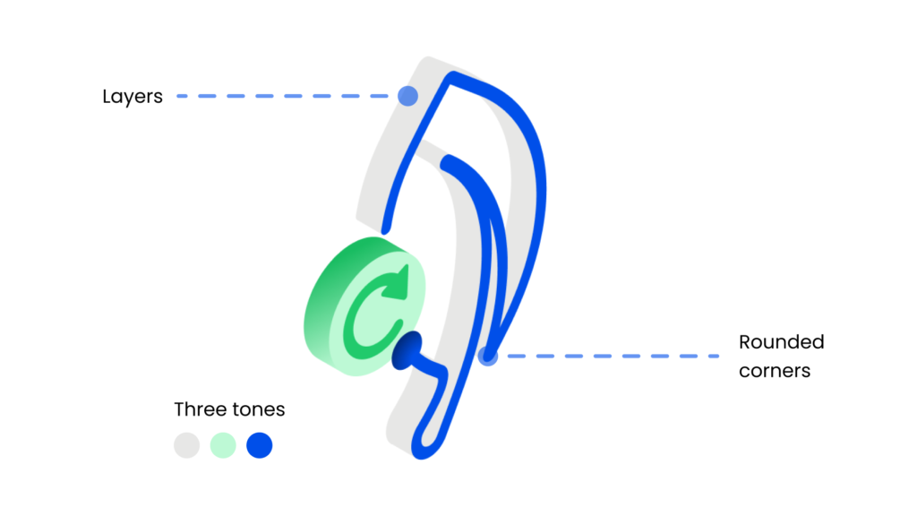
It's all about the details
Enhance your design with added detail. Our isometric icons bring depth and clarity, making it easier to communicate concepts and ideas. Its main use is for infographics, presentations, and landing pages.
While there are no strict grids to this set of icons, there are a few rules for consistency.
Use three tones. To keep the icons simple and clean, choose three main colors to work with (from our brand color palette, of course). You can use their lighter/darker tones for details such as texture.
Play with layers. To give more volume and depth to a illustrative icon, play with more than one layer, adjusting the depth and position of each layer for a deeper effect.
Always rounded corners. They make our icons more friendly and match our brand look & feel.
Social Media
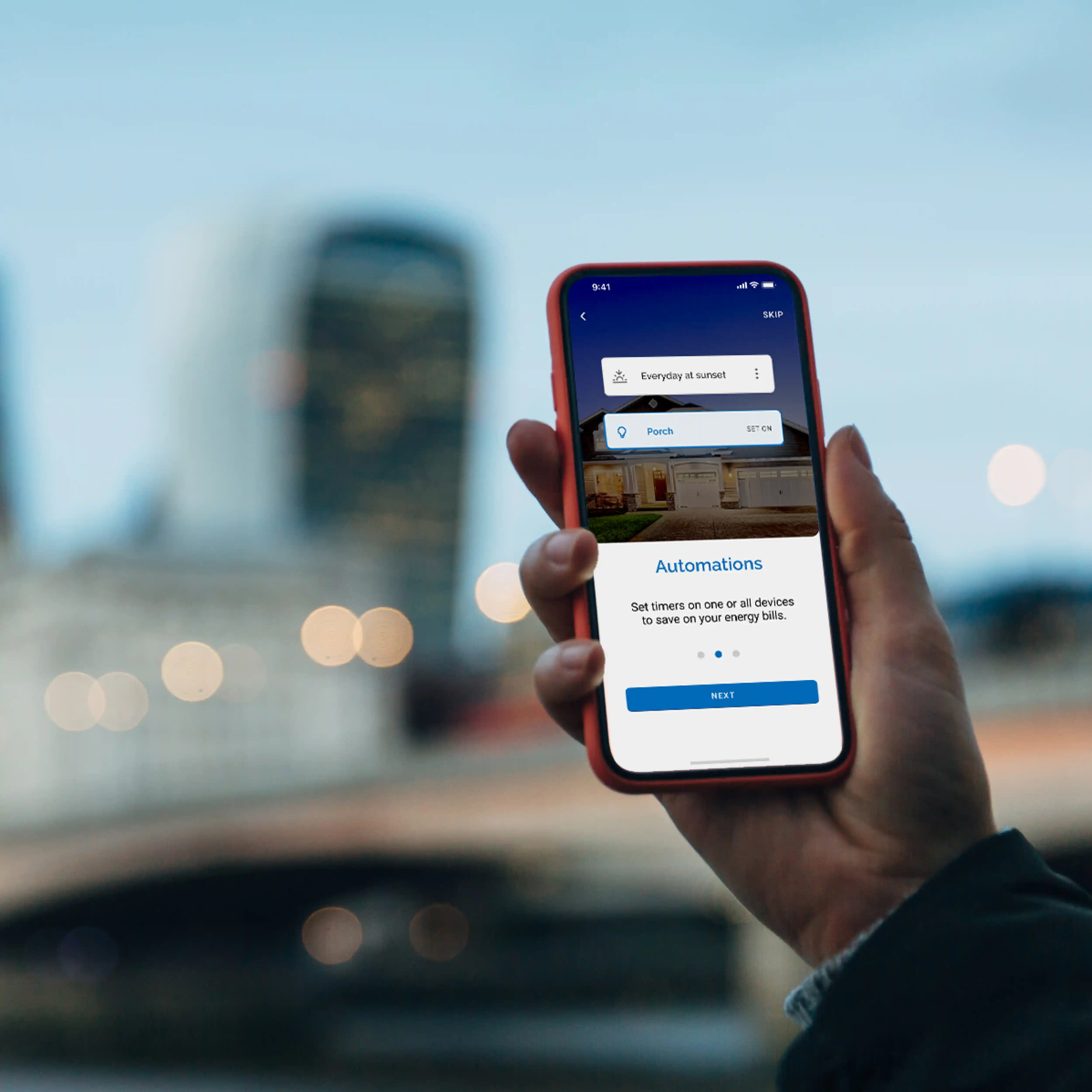
Photography is a big part of expressing our brand. While keeping a professional tone, we make sure the photos we use are diverse, inclusive, smart and positive.
Our Social Media Library
Website
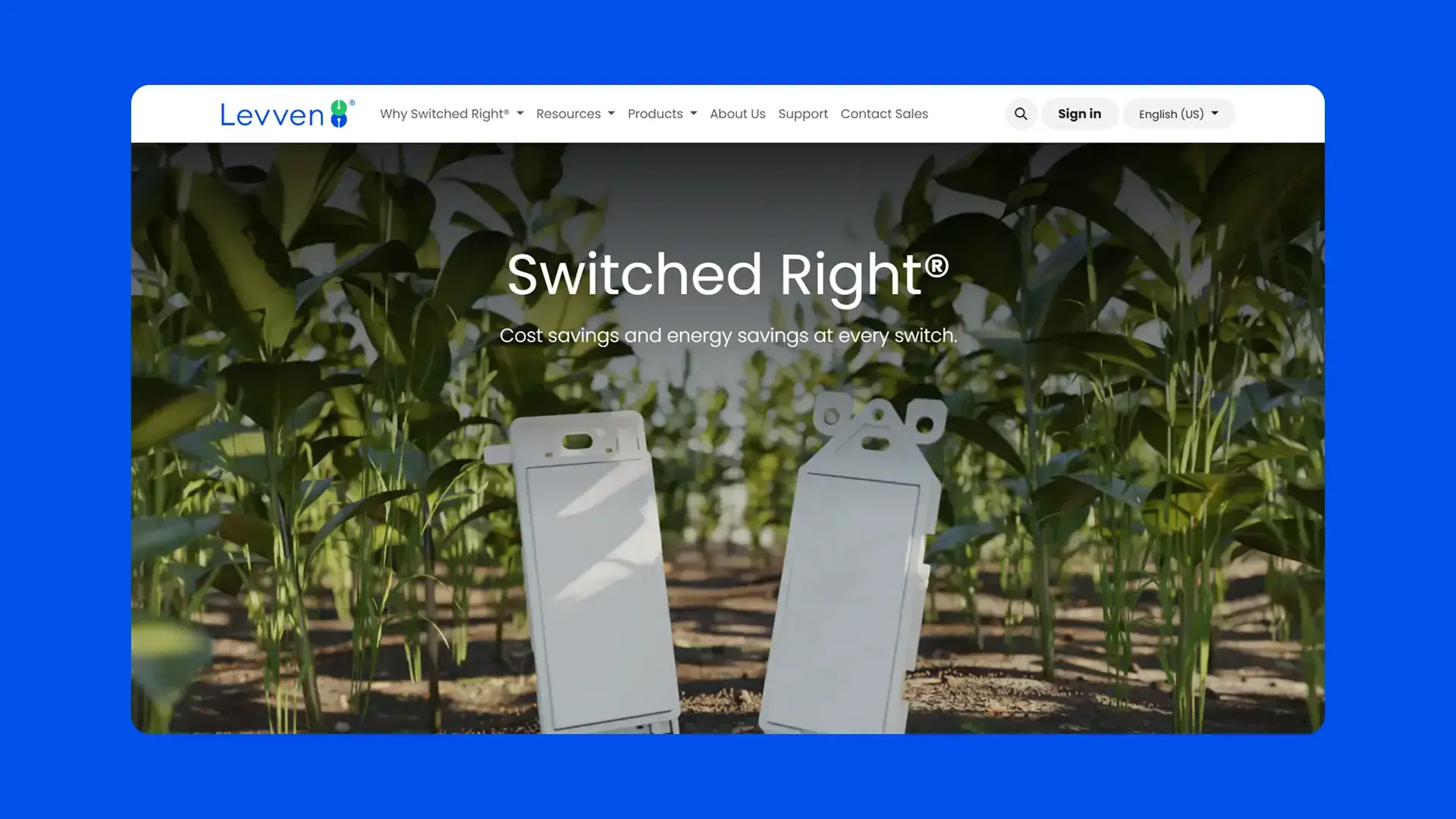
Our website is the biggest reflection of our brand. It’s one of the first points of contact between the customer and Levven, and always reflects our mission, values, and aesthetics.
Our website • levven.com
Promotional Materials
Our design features offer a range of tools to create visually stunning websites. Utilize WYSIWYG editors, drag-and-drop building blocks, and Bootstrap-based templates for effortless customization. With professional themes and an intuitive system, you can design with ease and precision, ensuring a polished, responsive result.
Printed Materials
Create pages from scratch by dragging and dropping customizable building blocks. This system simplifies web design, making it accessible to all skill levels. Combine headers, images, and text sections to build cohesive layouts quickly and efficiently.
Bootstrap-Based Templates
Design Odoo templates easily with clean HTML and Bootstrap CSS. These templates offer a responsive, mobile-first design, making them simple to customize and perfect for any web project, from corporate sites to personal blogs.